Landing pages can be tricky territory for businesses and prospects. We’ll answer the questions you have and give you some real-world examples.

OK, so what is a landing page and why do I need one?

A landing page is most easily thought of as a mini-website that performs one specific function: It turns visitors into leads. 

How? By providing your visitor with something they want (an e-book, a download, a how to guide, etc.) in exchange for something you want (their email address, name, or phone number).


Why do I want their information?

Forrester research says you must be overt in asking for prospects information and covert in using it.  You want their information so you can send them information, deals, and further develop that relationship, which will help turn them from a prospect into a customer. Just don’t be creepy about it.

Why not just send them to my website?

Good question: There are two reasons.

First, your website is a repository of information, where potential customers can check you out on their terms.  

sales funnel

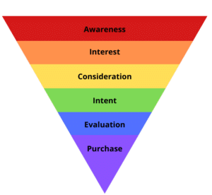
Unfortunately, because of this passive nature, your prospects can navigate away before giving you an opportunity to create a relationship.   A landing page is designed to start this relationship by creating an engagement opportunity. It moves your prospect further down that all-important sales funnel.

Second, your website is most likely built to collect visitor information only when they purchase something.

But what if you’re a service industry, or you sell a type of product that doesn’t fit into the normal e-commerce framework, or you sell a product that has a longer buyer’s journey, like a house or a car?  Having a landing page will allow you to consensually gather visitor information and provide them with something of value.  This makes your brand credible, trustworthy, and familiar to your visitor.

A landing page solves both problems by

  • Having one clear call to action so your visitors are more likely to act
  • Being specifically designed to gather information so you can start that relationship

What should be on a landing page?

You know your business offerings best, but here are some guidelines to make sure you’re getting the best return on your landing page.

Landing page checklist

Research from 2015 says the average person has an attention span of about 8 seconds, but more recent studies say people can focus for longer if they perceive value in the object of their attention.  Keep this in mind when creating your landing page. How can you create value for your visitor, other than the marketing emails they know they’ll be receiving?

Another thing to keep in mind is this:

Generally speaking, the more information you’re asking from the visitor, the higher quality offering you should be making in exchange

For instance, people may give you their email address for the privilege of receiving your newsletter or a short how-to guide, but they may give you their postal code, company name, and salary range if you’re offering something they perceive to be of higher value like an e-book, exclusive deal, or whitepaper.  Just make sure the value of your offering is worth the effort needed to fill out the form.

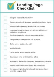
Here are two hits and a miss to give you some real-world examples.

Example 1 Sign up for a book club email

book of the week


This is an effective landing page for a book club because:

  • It clearly and directly relates to the link we clicked
  • The books in the background speak to the offer
  • We only need to give one piece of information to become part of the club

We know we’re signing up to receive marketing emails from this company, but we feel like the value of the book suggestions is worth it.

Example 2: Try Shopify (who we love) for freeShopify landing page
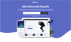
This landing page is where you end up if you click “Try it for free” from their main webpage. 

  • It is clearly branded – the Shopify logo is top and centre
  • It has a simple and compelling title and header
  • White space is in the middle of a darker background, so my eye is drawn to it immediately
  • It only asks for one piece of information

Now, If we wanted to know more, we could scroll down and see all the different things they offer, but nothing on the page is clickable, until we get to the next button that says “Start free trial”.  This means we can’t get distracted and click away until we sign up.

 
Example 3: Sign up for a cruise newsletter
 

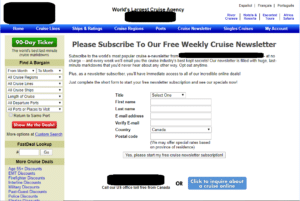
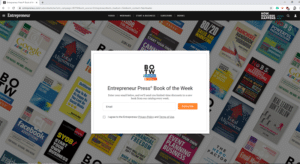
Seems simple, doesn’t it? But when it’s not done well, it can confuse or annoy users. This one didn’t hit the mark and here’s why:

  • The branding is generic and not memorable
  • The language is very similar to the rest of the website, but there’s too much of it!
  • The design is cluttered, and you can click away on just about everything on this page. Our eye is particularly drawn to the green “90-Day Ticker” button, and the red button that says “Show Me the Deals”
  • The call to answer sounds like a request rather than an offer
  • They’re asking for a lot of information for the privilege of sending marketing material
  • Can you find the call to action button? We had to search for it!  Hint: It’s the white button that says “Yes! Start my free cruise newsletter subscription!”
  • This site sells vacations which are an inherently emotional thing. It might be beneficial for them to use some imagery where the visitor can imagine themselves on a cruise

Landing page fail

One final note

CASL (Canadian Anti-Spam Legislation) and UK’s GDPR (General Data Protection Regulation) have some pretty strict rules about how and when you can market to people, and what you do with their information.  Since visitors must take the action to give you their information, a landing page allows you to consensually gather information. If you have a CRM that tracks where each email address came from, then you’ll have a much easier time staying compliant. There are different rules for different types of organizations, so make sure to do your research (Hint, we can help).  Remember: With great power comes great responsibility!

Social Holiday cover image

The Social Holiday: Your Complete Guide to Making Social Holidays Work for You

Struggling to balance Donut Day posts with your client stories, product descriptions, and other sales-focused social content? We’ve got you covered. Download our ultimate guide to making social holidays work for you.

Bold. Modern. Competitive.

(Just like you)

Unrivald pattern of icons
Social Holiday cover image

Thank you!
Please click the button below to download The Social Holiday guide.

Thank you!
Please click the button below to download the digital marketing scorecard.

Gary Pitcher

Web Developer

Gary has forgotten more about technology than most of us will ever know. He’s worked in dozens of industries in a wide variety of roles and solves difficult problems recreationally. By the time you’ve formulated your question, Gary already has an answer, which would be annoying except he’s so darned nice about it.

Adrian Proctor

Web Developer

When you put Adrian behind a keyboard, magic happens. On stage, that means he’s making music. At work, he’s bringing website designs to life. Adrian is probably the quietest member of the Unrivald Digital team, but when he speaks, we all listen because we know he’s got something important to say.

Shaheen Bhimani

Director

Shaheen is the guy you want in your corner when you’ve got a complex problem to solve in the next 15 minutes. He’s part MacGyver, part Tony Stark and part while still being the nicest guy in the room, hands down. His soft-spoken, down-to-earth vibe and ability to deliver makes him a client favourite.

Blair Shunk

Founder

Whether leading a meeting, riding his motorcycle, or running in the Banff Jasper Relay (for which he was Race Director for many years), Blair connects with the world around him. He inspires his team to work hard while never forgetting the value of the relationships he builds with clients.