Let me guess: you are now asking yourself how design is related to the purpose of your business, right? Design seems to be the most underestimated aspect in business discussions. The reason? It is constantly associated with appearance only. Of course, aesthetic matters; however, a good design is meant to be supported by three things: a shape, a meaning, and a function. And it can be applied to your business as well.
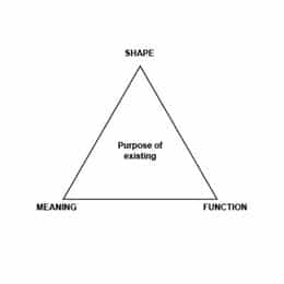
This is based on the Peirce’s Theory of Signs or Semiotic Triad. Basically, Peirce said: for a message to be successfully transmitted, it has to have a sign, an object, and an interpretant – not an interpreter. Put simply: to successfully communicate we need words, the meaning of them, and what our recipients understand from that message. The same is true in regard to design and your business.
Design = Communication
Let’s think about the design of a newsletter creative or a landing page for your business. To fully accomplish the purpose of creating something we need:
- It needs to look good. It must be up-to-date, follow current trends, obey brand guidelines, etc. That job is usually accomplished by professionals and agencies with aesthetic-oriented skills. It’s a combination of art and math. And it works, believe me! We are talking about the shape of it, one of the essential arms in our triad.
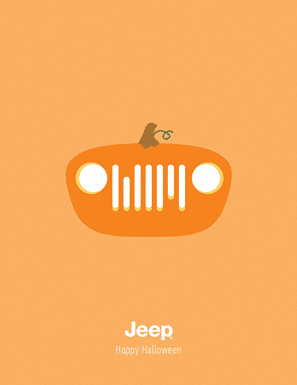
In Jeep’s Halloween campaign, it’s very clear. Creativity, a harmonic color palette, symmetric shapes, alignment, white space, etc. On the other hand, if the colors were different or if the car headlights were uneven, would it still look nice?
- It needs to have meaning. Is it aligned to what we want to say? Is it literal or does it have a hidden meaning? Is our message targeting the right audience? If our design does not mean anything, why are we doing it anyway? Back to the ad we were talking about. It has a clear meaning. It’s making a creative association with the shape of the car and a halloween pumpkin. However, what if the shape didn’t remind us of the pumpkin? Would it still be understandable?
- It needs to function. If our design has a shape and a meaning, what are the objectives we are trying to accomplish? Increasing sales? Bringing awareness to a new service? Generating new leads to our products? Providing content to our audience? Jeep’s Halloween poster functions as a connection-keeper between the brand and its audience. By communicating in a relevant way, Jeep is keeping the brand alive in people’s consciousness. It’s subtle and it can be decisive in the buying decision.
With a good shape (aesthetically speaking) and a good meaning (it’s a Halloween ad), could it go wrong? Sure. Imagine publishing this ad in a city’s newspaper with no Jeep resellers. What is the reason for that?
Only by combining these three elements, we can confirm that a design has a purpose of existing. The ad looks great, even being that simple. It has a clear message and meaning. Moreover, it has a discrete and true function.
Bringing that concept into business
Most businesses are all about communication. Remember: communication is design and vice-versa. Whether it’s written, spoken or visual, make sure your business is using the proper language. Don’t let your business turn the autopilot on. Think of your business like a white canvas. It is not a matter of how much paint you put on it. People won’t find it beautiful if there is no message or function. Make it clear!
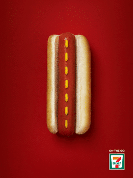
For example in this 7-Eleven ad, we can clearly see a pleasant design, conveying it is intended for on-the-go. How much of typing did it require for you to get their point? Did they need to fill up the page with bold headlines or fancy graphics? No. Everything on it has a reason for being there.
The 5-second rule
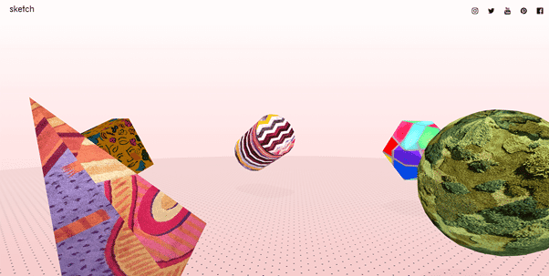
If someone spends more than 5 seconds and still doesn’t understand the point of your communication, you might need to change what seemed to be a brilliant idea. Below, you can see a snapshot of a website that lists 5 places to eat in London. It took me a long time to click on all of these floating shapes and find out what is the real point of it. I will admit, I’m still not convinced. Are they trying to promote it? Do they own all of the places?
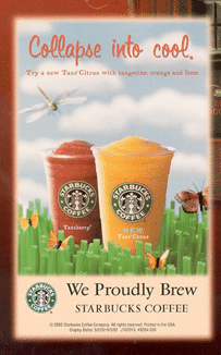
Do you think it only happens to small businesses and agencies? Wrong! Some time ago, Starbucks launched this campaign, promoting two new cold drinks in their venues. It looks fresh, right? It should be no problem–except that it was released in 2002, one year after September 11. Now take a look at that again and ask yourself: were those shapes appropriate? What was the point of using the word “collapse”? Is it really a dragonfly? Why did they draw the grass as building-like square shapes?
Make sure your creative agency takes into account all of the elements of visual design. A good design might be the spark your business needs to stand our from your competitors and set your business on the path to success.


